Colors of Calm: Choosing the Right Palette for a Stress-Free Home
Color is more than just a visual experience—it’s an emotional one. The colors we surround ourselves with can directly impact our mood, energy levels, and even our ability to relax. When designing a home that feels like a sanctuary, selecting the right color palette is essential. From soft blues to warm neutrals, the right hues can help create a peaceful, stress-free environment where you can truly unwind.
The Psychology Behind Color
Color psychology is the study of how colors affect human behavior and emotions. While individual preferences and cultural influences play a role, certain shades tend to evoke universal feelings. In home design, using calming colors can lower stress levels, reduce anxiety, and encourage a sense of comfort.
Blissful Blues
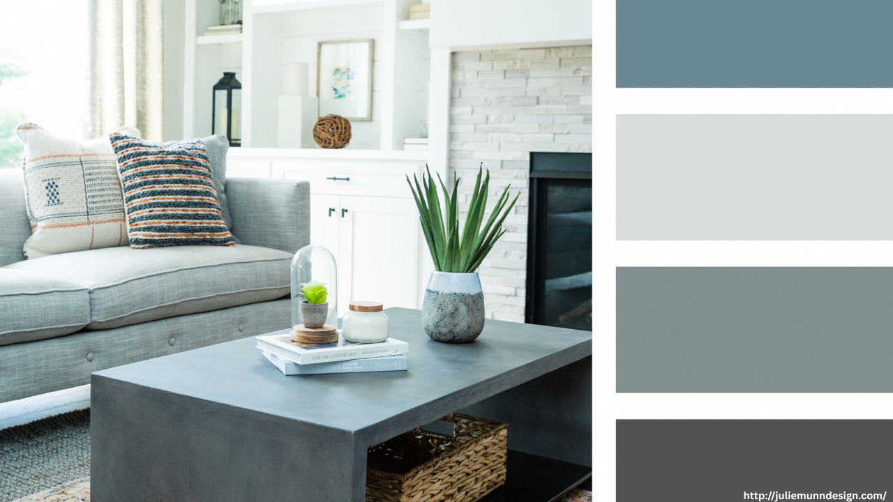
Blue is widely recognized as one of the most calming colors. Reminiscent of the sky and sea, it evokes feelings of serenity, stability, and peace. Soft blues, such as powder blue or sky blue, are ideal for bedrooms, bathrooms, or any space intended for relaxation. Deeper blues, like navy or slate, can also be soothing when paired with lighter accents to maintain balance.
Gentle Greens
Green symbolizes nature, growth, and renewal. It’s a refreshing yet restful color that helps reduce anxiety and promote harmony. Sage green, mint, and olive are excellent choices for living rooms, kitchens, or reading nooks. These shades bring a sense of the outdoors inside, making the home feel more grounded and nurturing.
Neutral Tones for Serenity
Neutrals like white, beige, taupe, and gray create a clean and timeless backdrop. These hues help open up spaces and allow other calming elements, like textures and natural materials, to shine. Soft greys and warm creams, in particular, offer a soothing, understated elegance. They can be used throughout the home to create continuity and a cohesive sense of calm.
Earthy Warm Tones
While too much red or orange can feel overstimulating, earthy variations—like terracotta, clay, and soft peach—add warmth without overwhelming the senses. These colors can provide emotional comfort and are especially welcoming in entryways, dining areas, or cozy corners. They work beautifully when balanced with neutral tones and soft textures.
Soft Pinks and Lavenders
Soft pinks, such as blush or rose, and muted lavenders are known for their gentle, nurturing energy. They evoke feelings of compassion, calm, and comfort. When used sparingly in bedrooms or quiet corners, these colors can add a gentle touch of tranquility without being too sweet or overpowering.
How to Use Color Mindfully
-
Stick to a cohesive palette: Choose 2–4 complementary colors and use them consistently across your space.
-
Use accent colors sparingly: Introduce calming accent hues through pillows, artwork, or rugs without overwhelming the room.
-
Pay attention to lighting: Natural and artificial lighting can dramatically change how colors appear. Test paint samples before committing.
-
Balance with texture: Soft textiles and natural materials can enhance the calming effect of your chosen colors.
By choosing a soothing color palette, you’re not just decorating—you’re creating an emotional atmosphere. A stress-free home begins with colors that speak to peace, comfort, and clarity.